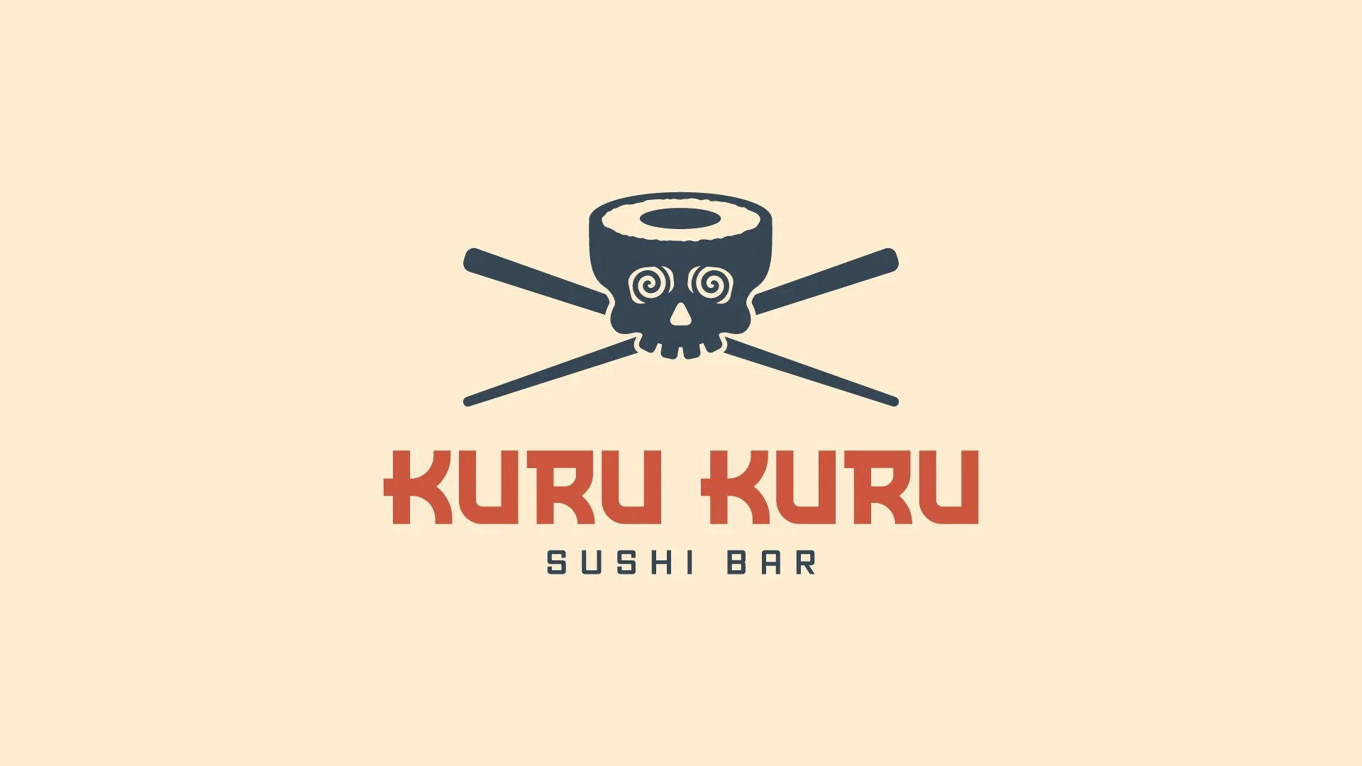
Kuru Kuru Sushi Bar is a rotary sushi concept inspired by the Japanese phrase kuru kuru, meaning “spinning” or “going around.” I developed a bold identity that translated that idea of motion into a playful, memorable brand.
KURU KURU SUSHI BAR
LOGO DESIGN / BRAND IDENTITY
My Role
Brand Strategy, Art Direction, Identity Design, Logo Design, Illustration, Client Presentation
Challenge
Create an identity that could feel playful and distinctive enough to stand out in a crowded restaurant market while still feeling polished enough to function as a complete hospitality brand.
Solution
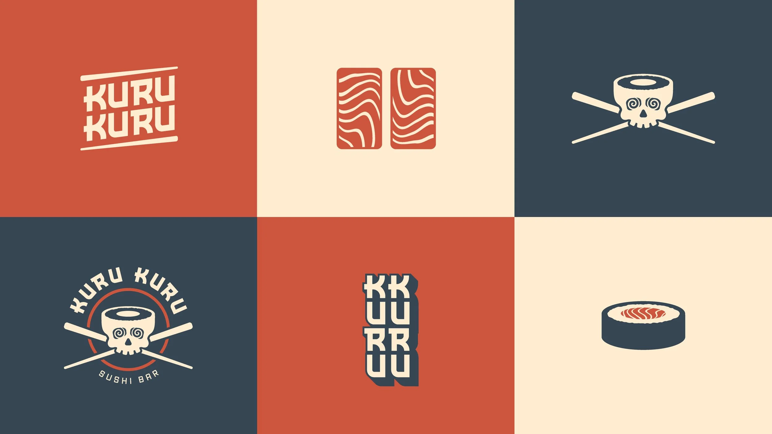
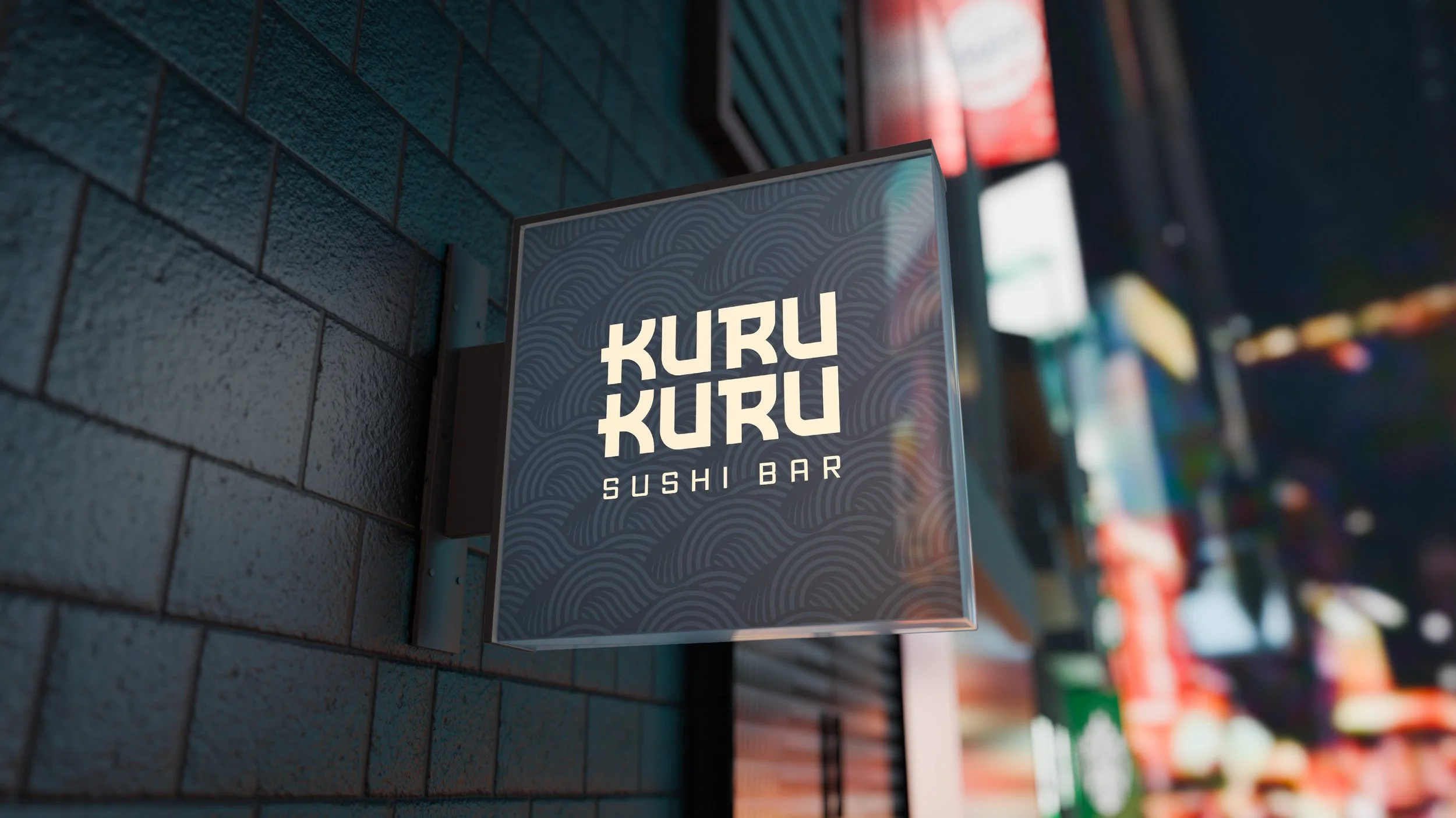
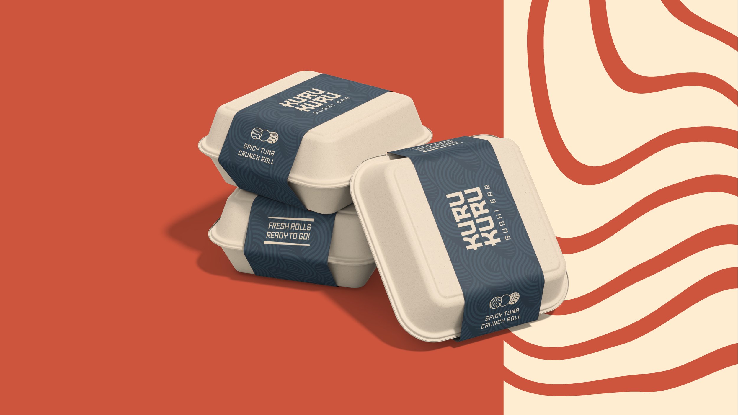
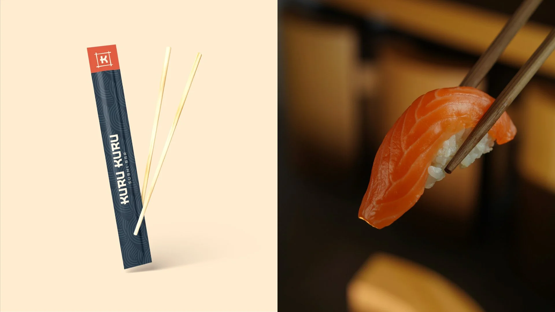
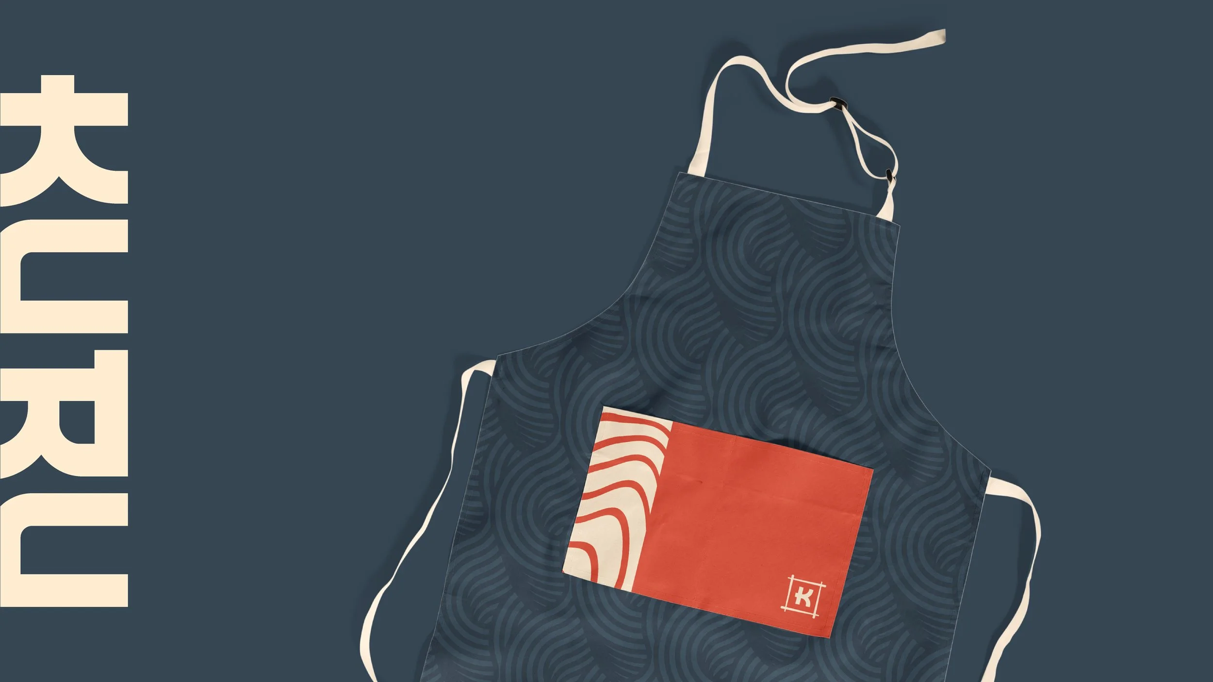
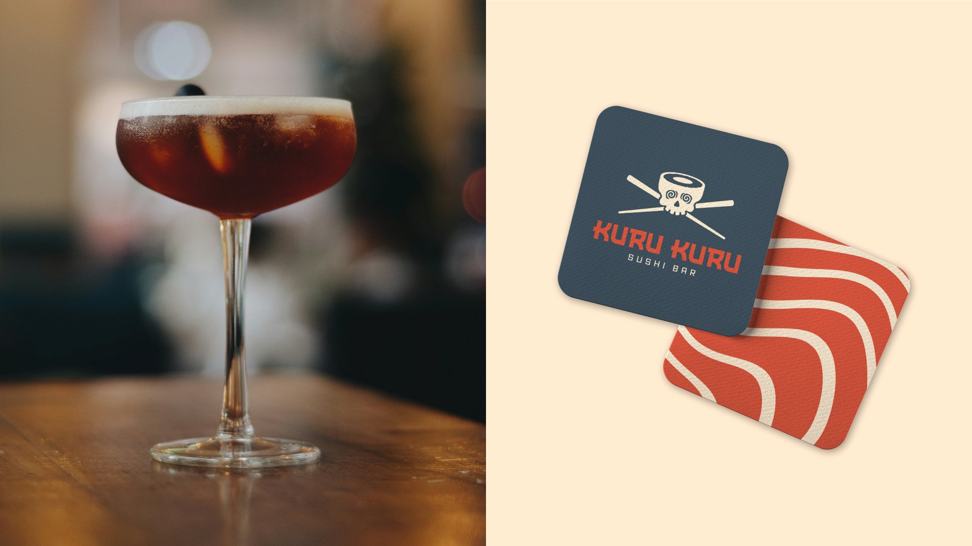
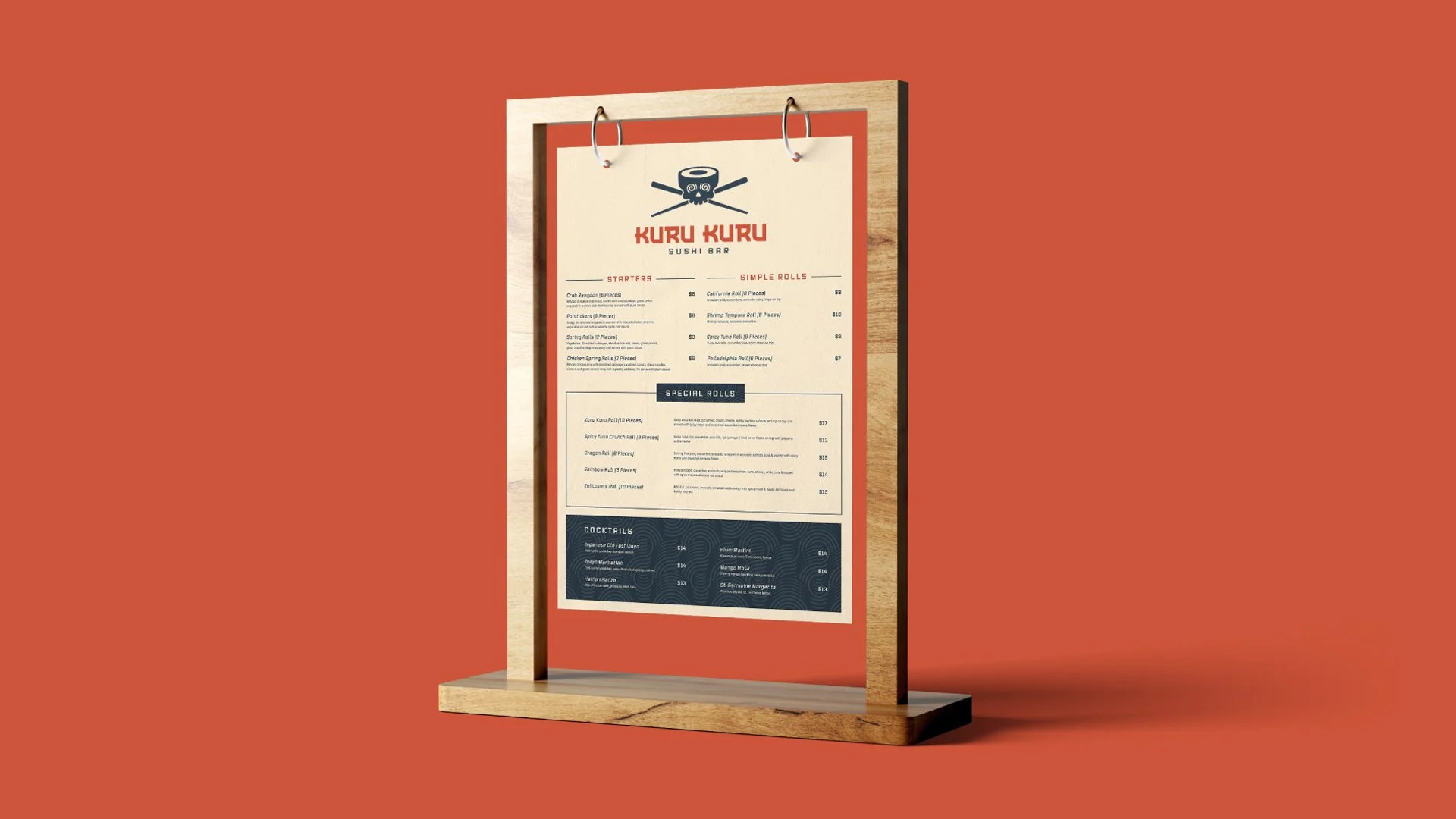
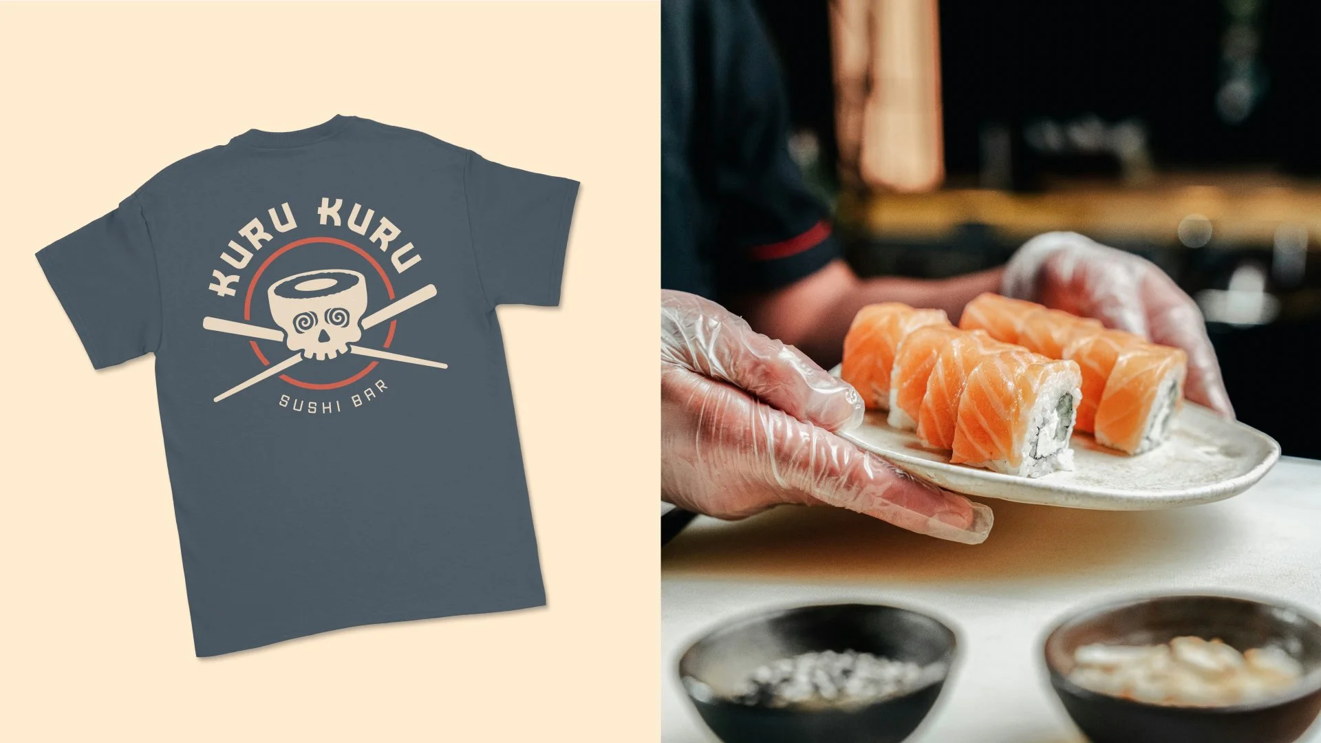
Working directly with the client, I developed and presented the creative direction for the brand. The final identity centers around a custom sushi-skull mascot with hypnotic spiral eyes, connecting the visual language directly to the restaurant’s rotating sushi concept. Strong typography and a simplified graphic system allowed the identity to extend naturally across menus, signage, merchandise, and other customer touchpoints.
Impact
The resulting identity gave Kuru Kuru a recognizable visual personality built around an idea unique to the restaurant itself, helping the brand feel energetic, memorable, and differentiated rather than relying on familiar sushi-industry clichés.